Bambam.ai
Revamped an AI-powered solution for automated business posts derived from inventory and market-centric hashtags.
Overview
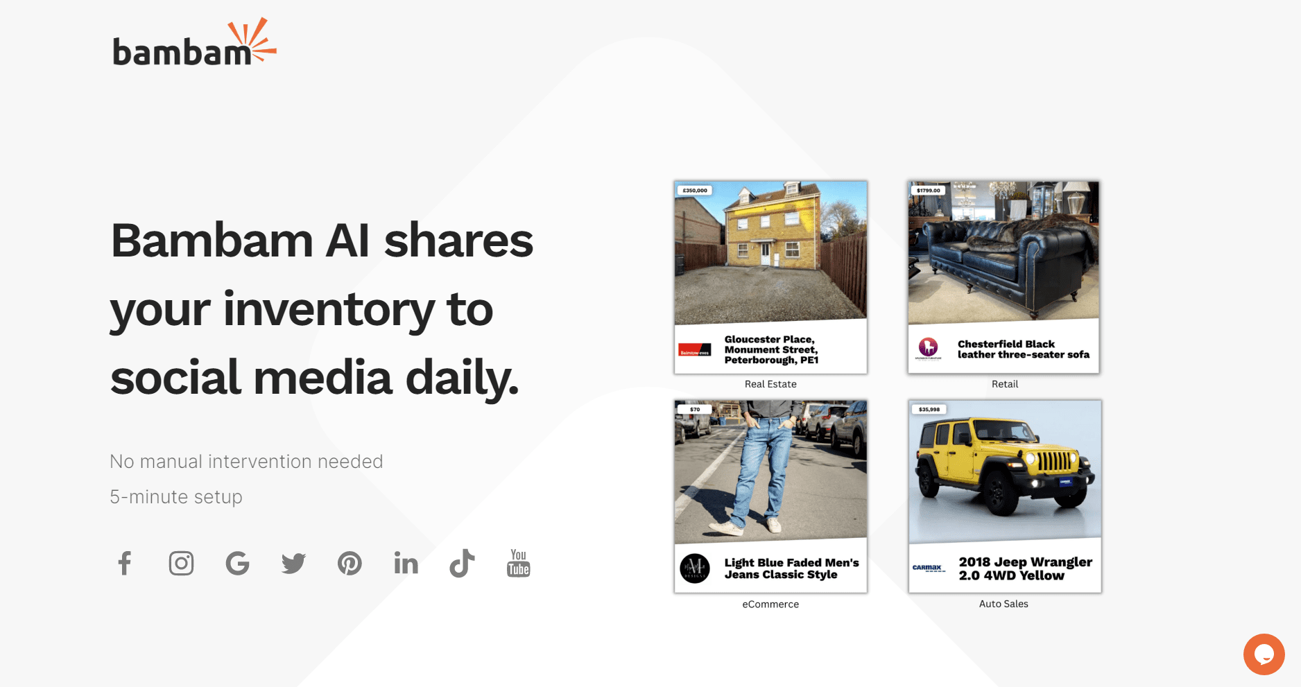
In today’s fast-paced, social media-driven world, businesses must consistently engage their audience with fresh, visually compelling content. However, keeping up with daily posts can be a challenge, especially for inventory-heavy businesses like real estate agencies and auto dealerships.
Bambam.ai offers an AI-powered solution that automates social media content creation and scheduling. By leveraging a company’s existing online presence and inventory, the platform generates daily posts with visually engaging graphics and market-relevant hashtags, ensuring a consistent and dynamic digital presence without the manual effort.
For Phase 1, the project scope included a full website redesign and a new branding direction. With no strong ties to its original color scheme or imagery, Bambam.ai sought a fresh, cohesive visual identity to better align with its mission and target audience.
Role
UX/UI Designer • Team Of 6 • Working under a Project Manager & Senior Designer.
Contact
Founder
Industries
AI • Retail • Advertising & Marketing
Type
Website • B2B
Tools
Figma • Loom • Zoom • Miro • Slack
Problem
As Bambam.ai prepared to launch its MVP, the company needed a website that effectively showcased its features and encouraged user sign-ups. However, the existing layout did not highlight the product’s benefits clearly, and the call-to-action (CTA) was merely an afterthought, a floating action button that lacked prominence.
The initial landing page had been hastily assembled, resulting in a design that failed to instill confidence in users. While the team had invested heavily in the back-end AI technology, the website’s usability and visual appeal had been overlooked. Key structural elements such as a navigation menu, footer, clear content hierarchy, and high-quality imagery, were missing, making the site feel incomplete and difficult to navigate.
Solution
The redesign focused on clearly communicating the MVP’s core value while guiding users toward signing up. The new layout prominently displays concise yet informative descriptions of how AI can streamline social media management for businesses. The CTA is now a focal point on each screen, strategically placed with contrasting colors and supporting text to drive engagement.
To ensure consistency and scalability, a Style Guide was developed, establishing the visual and UI foundation for Phase 1 and future iterations of the product. The new design balances excitement, clarity, and accessibility, creating a professional yet engaging experience.
Additionally, essential website elements were integrated to provide structure and enhance usability. The revamped landing page delivers compelling messaging, while supplemental pages offer a clear, guided experience; helping users navigate the site seamlessly and find the details they need to make an informed decision.
DISCOVERY
Team Kick-Off Meeting
The team convened over Zoom to introduce ourselves and align on the project goals. After reviewing Bambam.ai’s existing website and briefing materials, we quickly identified key usability challenges and began brainstorming potential improvements. Excited to dive into ideation, we focused on refining user flows to enhance clarity and engagement.
Before mapping out the user experience, we established a rubric for success based on the client’s priorities. They requested clear, informative pages that would:
• Explain how the product works
• Provide contact options for further inquiries
• Showcase pricing plans
Additionally, the client came prepared with a set of user stories, providing valuable insight into their vision and target audience. These served as a foundation for shaping the redesigned experience.
Client's Original Content
#1
As a user, I want the ability to learn more about the service and how it works.
#2
As a user, I want to know more about the company and its mission.
#3
As a user, I want to be able to know the two types of pricing (Lite or Pro).
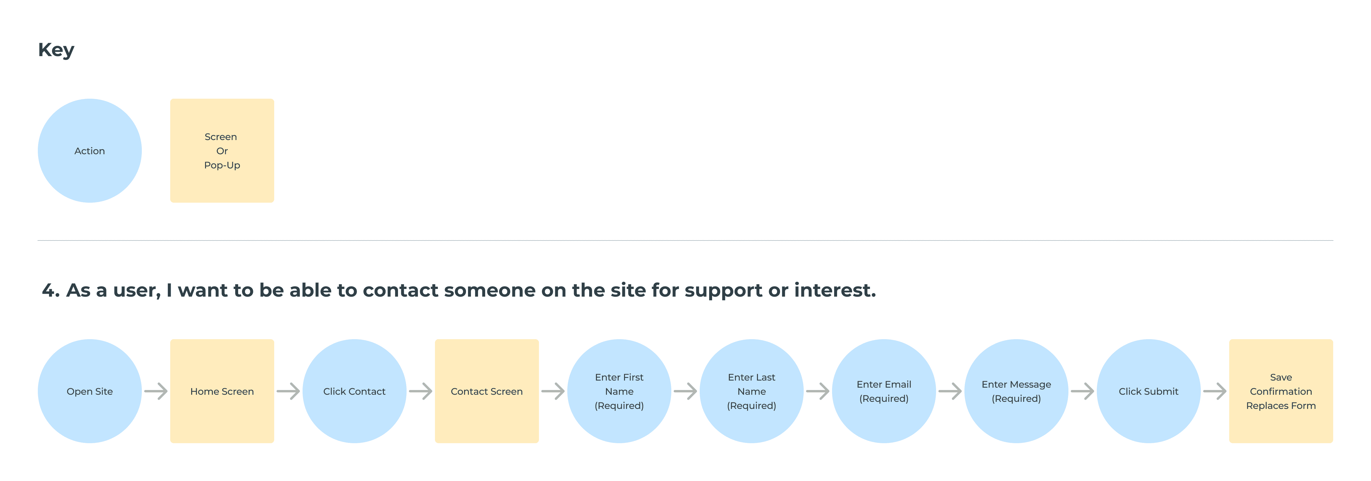
#4
As a user, I want to be able to contact someone on the site for support or interest.
#5
As a user, I want the ability to create an account.
#6
As a user, I want to be able to log-in to my account.
User Flows
As a team, we outlined the foundational site map and mapped out the key user journeys, ensuring a seamless experience for completing essential actions. Each flow was designed to guide users toward their goals with clarity and efficiency.
I was specifically responsible for designing User Flow #4 - the contact form. This flow served as an extension of Bambam.ai’s primary call to action: encouraging users to sign up for the service. The form needed to be intuitive, accessible, and aligned with the overall user experience, making it easy for potential customers to reach out and take the next step.
Ideation
Sketching
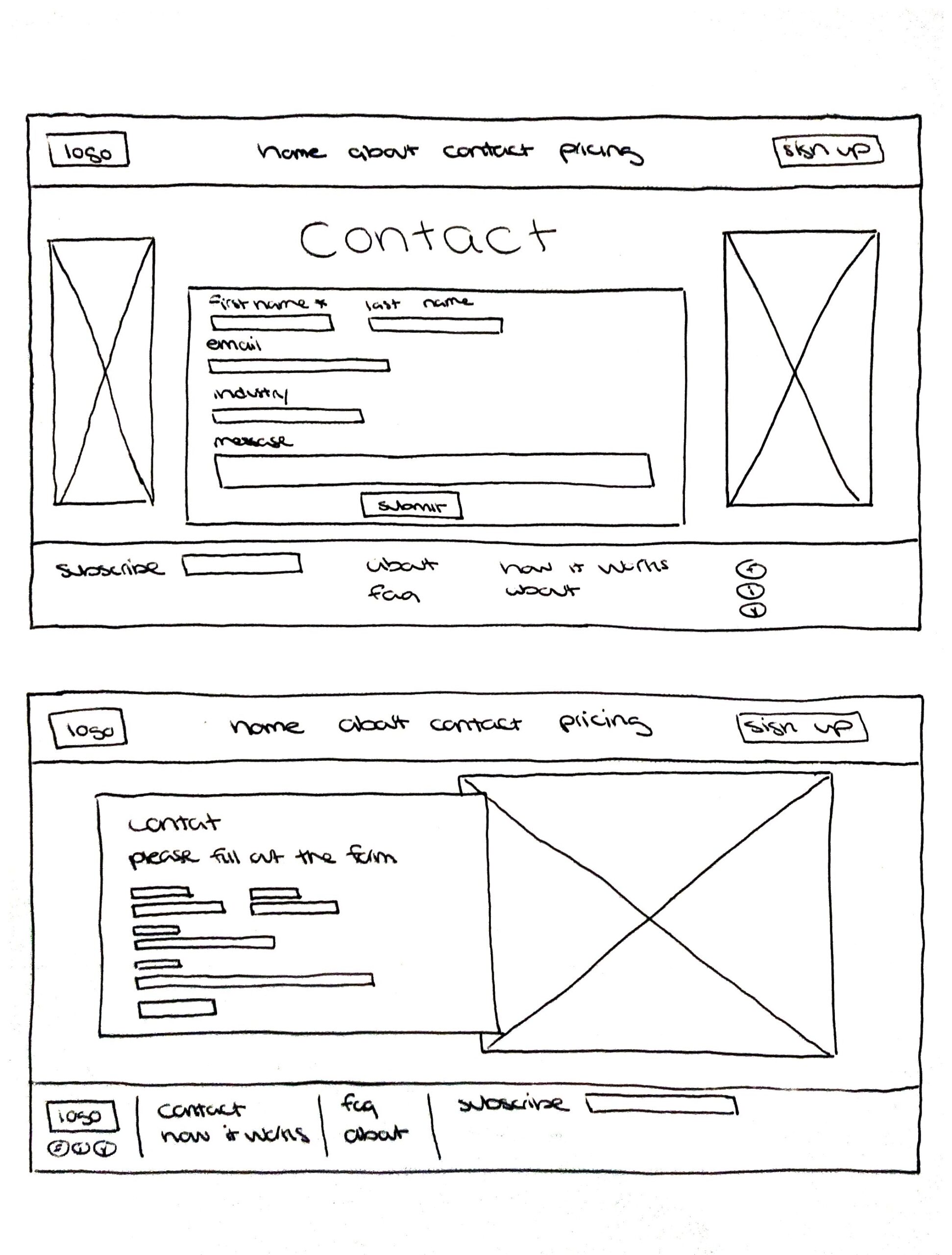
Before diving into digital designs, I explored different layouts for the contact form, experimenting with the placement of input fields, imagery, and overall structure. Given Bambam.ai’s goal of attracting a broad customer base, I prioritized a simple and inclusive form design, ensuring it functioned as a general contact form rather than filtering out potential users too soon.
While sketching wasn’t a required step for everyone, I found it essential for visualizing my ideas on paper before refining them digitally. This process helped me quickly iterate on different compositions and identify the most intuitive and visually appealing approach.
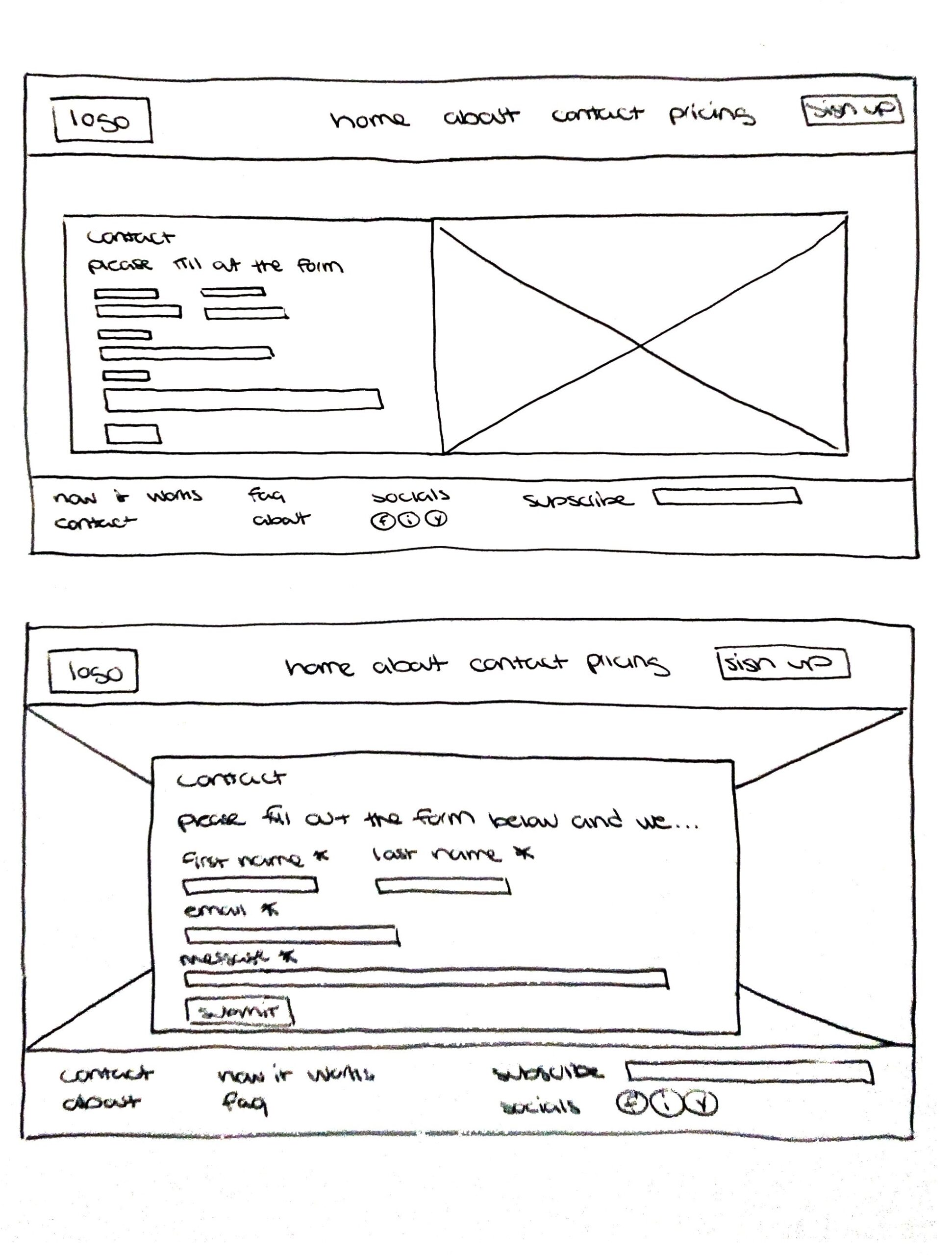
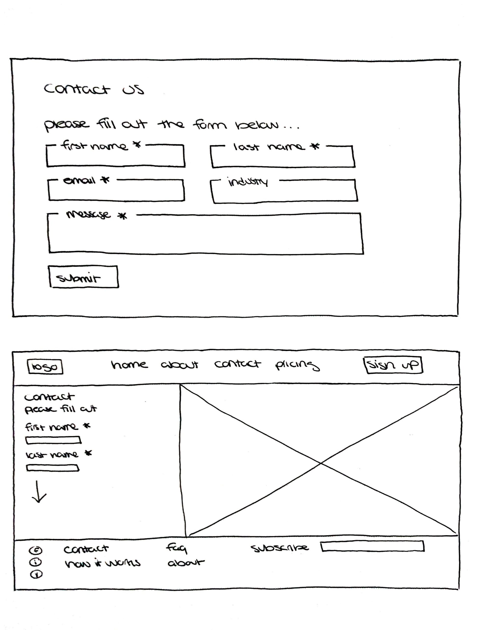
Mid-Fidelity Wireframing
Building on my initial sketches, I translated my ideas into grayscale wireframes in Figma, working with realistic proportions to fine-tune the layout. Key decisions included determining padding around input fields, optimizing white space for readability, and ensuring a clean, structured design.
To maintain visual consistency across the site, some elements were removed, such as a full-screen background image behind the form as other designers had opted for a solid background in their flows. As we compared my wireframes with those of my teammates, we began to see how the individual components would come together into a cohesive website.
After reviewing our first iteration, we noticed that the screens felt visually sparse due to limited content. We realized we needed more details on how the AI technology works and how it benefits customers, prompting us to send additional questions to the client for clarification.
Design
Design System: Initial Style Guide
To establish a cohesive visual identity, the team created a Style Guide in Figma, initially consolidating colors, components, iconography, and typography into a single frame (right). However, to improve organization and readability, I expanded the guide by categorizing elements into separate sections (below), ensuring each topic had its own dedicated space. This new structure aligned with industry-standard style guides, making it easier to reference and maintain consistency.
I specifically took on the grid system and cover page, while also assisting with the color display arrangement and overall layout. This guide became the foundation for the design team, serving as a reference point for implementing the selected UI elements consistently throughout the project.

Style Guide Prior To My Redesign & Additions


UI Inspiration
Since my primary focus in this project was designing the contact form, I researched successful real-world examples from major brands, best practices from industry articles, and creative design explorations. This research informed the three different UI iterations I developed for the client to review.
One key insight I gained was that shorter forms generally lead to higher completion rates. Users who are not yet fully committed to a product tend to have low tolerance for lengthy forms with multiple required fields. Given that Bambam.ai is a relatively new product, it was crucial to keep the form concise and frictionless to encourage engagement from potential users who might not yet have strong brand loyalty.
UI Iterations
As a team, we developed multiple UI iterations for the landing page, narrowing them down to our top three to present to the client. The goal was to provide diverse layout and color scheme options, allowing the client to select elements that best aligned with their branding and business objectives.
To capture the client’s vision of excitement and energy, I experimented with light and bright tones. While the original orange was a central brand color, I found it challenging to work with in terms of accessibility. As a result, I explored alternative color schemes, including a purple-themed iteration and a green-toned variation, offering fresh yet dynamic approaches.
By presenting distinct design directions, we provided the client with the flexibility to mix and match elements that resonated most with their vision, ensuring a visually engaging and brand-aligned final product.
High-Fidelity Screens
The client selected a design iteration that maintained the clean aesthetic of the original website while incorporating orange and blue accent hues for a refreshed, modern look. With approval to move forward, we refined our wireframes by integrating missing elements such as color, imagery, strokes, and backgrounds to bring the design to life.
While we had a clear blueprint, each screen required careful attention to detail to ensure it aligned with the client’s vision. We focused on maintaining a consistent UI across the site so that every page felt cohesive and visually harmonious.
For my High-Fidelity Screen, I made key decisions regarding input field colors and form background styling, as these elements were not explicitly defined in the chosen UI iteration. Small refinements were made to align with the approved design, and once updates were implemented, we submitted our latest version to the client for feedback.
1st Redesign
Based on feedback, we identified key areas for improvement that directly impacted my user flow:
Color Accessibility – The original orange and white button did not meet WCAG accessibility standards, making it difficult to read for users with visual impairments. A more accessible color combination was implemented to improve legibility.
Spacing Consistency – Inconsistent spacing was noted across various flows, particularly between input fields and top navigation elements. Adjustments were made to ensure a more cohesive and visually balanced layout.
I made the necessary updates to my assigned areas following the newly refined Style Guide. For broader refinements, such as layout adjustments to pricing options and other pages, the team worked collaboratively to ensure consistency across the entire design.
Additionally, once we received clarification from the client, we were able to enhance the About page and refine the service pitch sections on the landing page, ensuring that Bambam.ai’s value proposition was clearly communicated to potential users.
Prototype
To bring our designs to life, we transformed our high-fidelity screens into an interactive Figma prototype that allowed the client to experience Bambam.ai’s functionality firsthand. This prototype enabled seamless navigation through key user flows, ensuring the design was intuitive and aligned with the product’s goals.
Each designer focused on refining their assigned user flow before collaborating on overall functionality. I specifically worked on integrating the contact form screen, ensuring it connected smoothly to relevant destinations. Additionally, I helped maintain a static top navigation bar, allowing users to move effortlessly through the site while keeping essential actions within reach.
By creating a realistic and testable prototype, we provided the client with a clear vision of how users would interact with Bambam.ai, facilitating meaningful feedback before development.
2nd Redesign
After the team finalized the high-fidelity designs, I took the initiative to refine the visual details, ensuring that every screen was pixel-perfect while reintroducing elements of Bambam.ai’s signature branding that had been subdued through multiple iterations.
To elevate the overall usability and scalability, I applied the industry-standard 8-point Layout Grid System, a widely used spacing method that establishes visual hierarchy, consistency, and efficiency. This structured approach not only enhanced the aesthetic balance of the UI but also streamlined communication between designers and developers. By maintaining consistent 8pt increments, developers could implement layouts faster without needing to measure each spacing decision manually.
Additionally, I introduced Figma’s auto-layout and components, which had not been utilized by the team. This ensured a consistent structure across all screens, reducing discrepancies and maintaining alignment throughout the flows. I also corrected areas where spacing was excessive or unbalanced, such as the confirmation modal, which initially felt clunky and awkward.
To enhance visual interest and brand emphasis, I refined conceptual graphics and key sections to better highlight Bambam.ai’s value propositions. A major update included a bold, eye-catching section displaying the seven social media platforms that users could integrate with for automated posting.
For the pricing table, I restructured the layout to emphasize the Pro package as the most appealing option. The Pro plan was framed in a bright yellow-orange with a white background, standing out against the Lite plan’s subdued gray version, strategically directing user attention to the premium offering.
Since Bambam.ai’s orange and yellow brand colors were difficult to use as text due to accessibility concerns against the off-white background, I repurposed these accent colors in icons and decorative elements to reinforce brand identity without sacrificing readability.
Lastly, I incorporated Bambam.ai’s mission, values, and vision, sourced from their LinkedIn presence, into a dedicated section on the sign-up page, placed below the form. This addition provided context and credibility, reinforcing trust in the brand for potential users at a critical conversion point.
These refinements ensured that the final product was not only visually polished and functional but also aligned with Bambam.ai’s identity and business goals.
Client & Developer Hand-Off
The team collaborated on refining the user flows, ensuring clear documentation of dimensions and interactions. To support a seamless transition from design to development, I contributed detailed measurements and annotations, highlighting key user actions, intended outcomes, and precise design specifications.
By providing clear guidelines on element sizing, spacing, and functionality, we aimed to create a shared understanding between designers and developers. This meticulous approach helped ensure that the final build accurately reflected the intended user experience while maintaining design integrity.
Reflection
Debriefing
This project was instrumental in shaping my approach to leadership, collaboration, and decision-making in future design work. I gained valuable experience navigating a team of diverse designers, identifying potential communication challenges, and understanding the importance of effective task delegation.
One key takeaway was the necessity of having a comprehensive understanding of the product from the very beginning. Looking back, I would have encouraged myself and the team to ask more in-depth questions about how the product functions and the client’s must-haves. A clearer initial understanding would have streamlined decision-making and reduced the need for multiple iterations.
Overall, I’m grateful to have contributed to a successful website redesign for an innovative AI-driven product. This experience reinforced the importance of strategic thinking, clear communication, and user-centered design; lessons that continue to influence my approach to team-based projects.