Siegfried Engineering
"We recently worked with Kara Prado to refresh our company website, and the results exceeded our expectations. The process was smooth, collaborative, and efficient--from initial concept to final launch. Kara brought a sharp eye for design, clear communication, and a deep understanding of how to translate our brand into a modern, functional site. Highly recommend for any firm looking for thoughtful, high-quality web work."
- Siegfried Engineering
Role
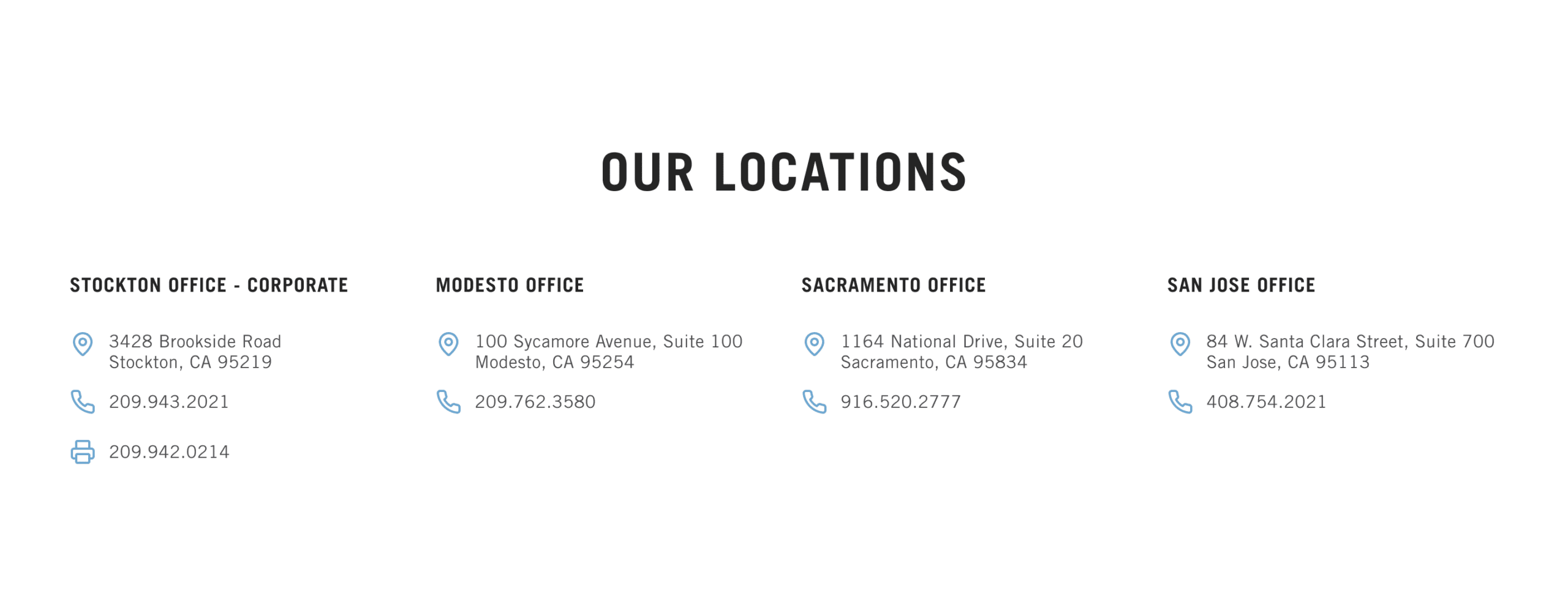
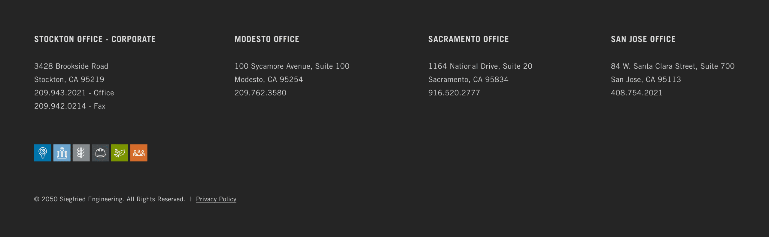
Contacts
Industries
TYPE
Original Site


Goals
- Modernize site for 70th anniversary
- Align with new brand guidelines
- Reduce small residential inquiries (focus on enterprise-scale leads)
- Expand storytelling (history, internships, community impact)
- Address accessibility and privacy compliance
Scope
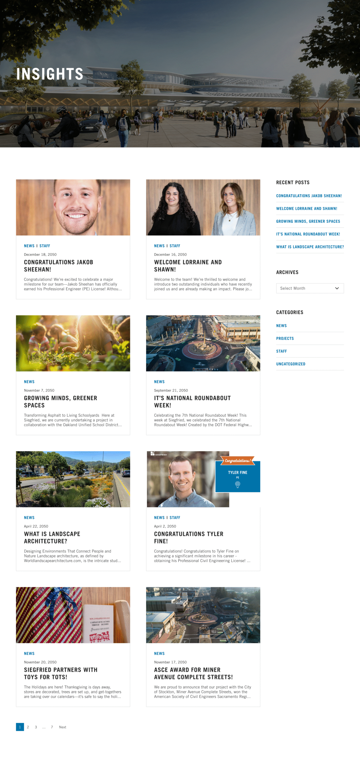
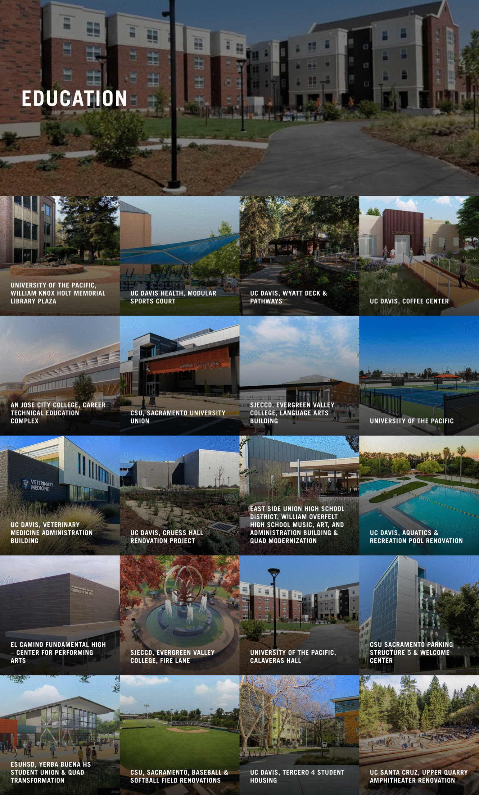
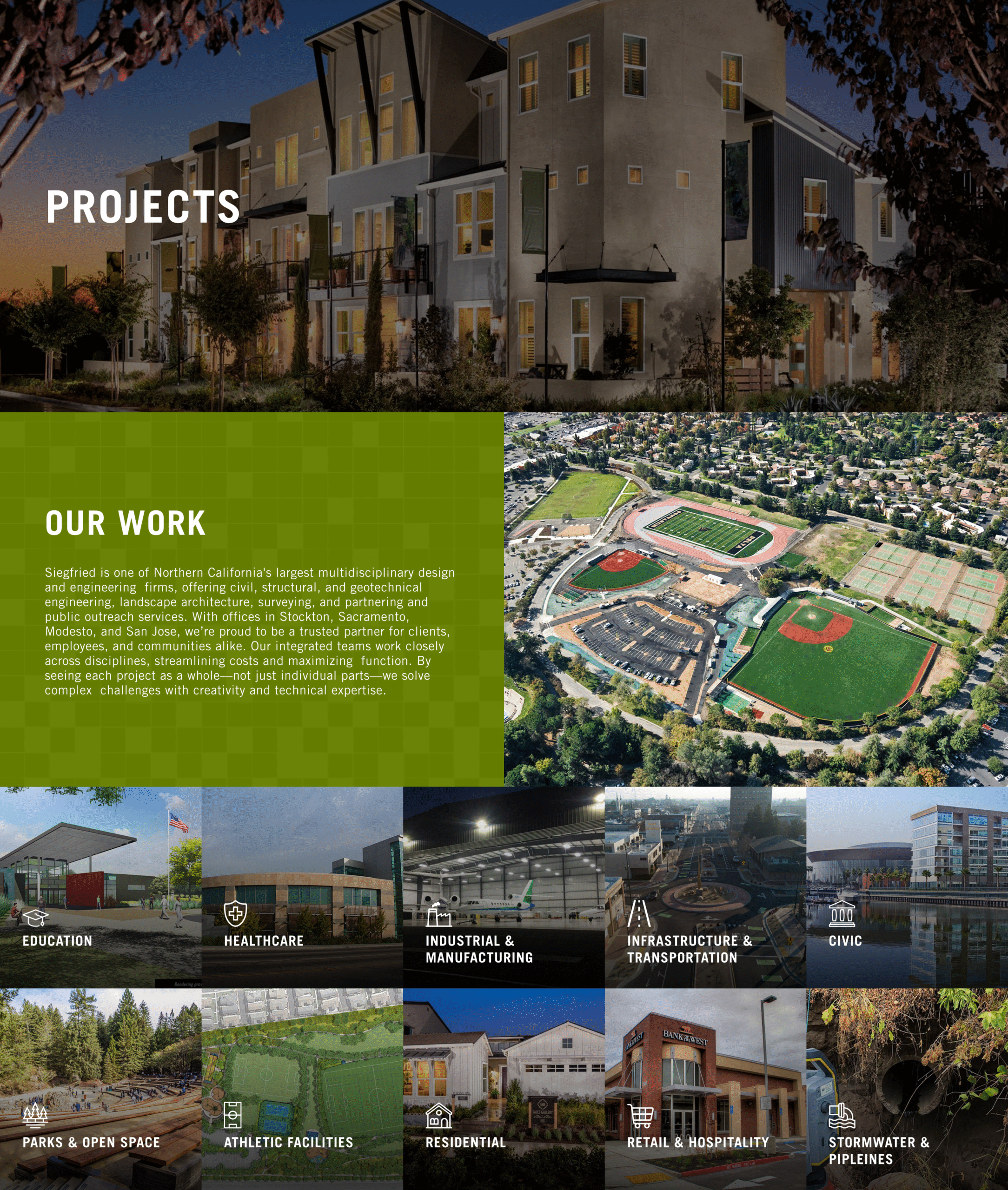
- Redesign & create 19 static pages + 2 dynamic (Projects, News)
- Create contact form with secure email integration
- Improve performance (PageSpeed score)
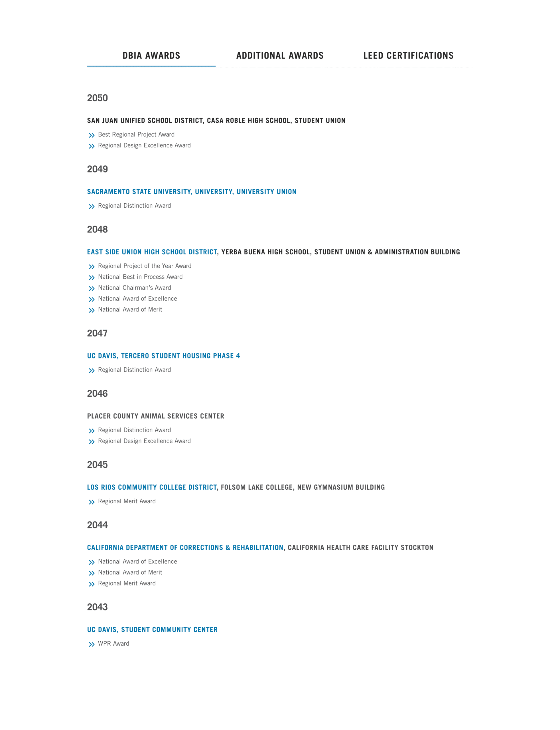
- Company timeline, awards tabs, internship & pages
- Create training documentation for internal staff

Tools
Design: Figma
CMS: WordPress (WPBakery & Salient)
Custom Code:
- HTML (WPBakery’s Raw HTML Element)
- CSS (WordPress’s Additional CSS Area)
Backups & Staging Plugin: WPvividBackup
Performance Plugin: WPRocket
Hosting: GoDaddy
Process
- Discovery call & proposal
- Collect intel on goals and gather inspiration
- 3 homepage prototypes → style direction selected
- 3 iterative design rounds for core pages
- 2 iterative design rounds for sub-pages
- Combination of asynchronous & live prototype reviews with client
- Development in the staging environment
- Final approval from the client VP → launch to live site
- Create handoff docs + visual tutorials via private website page
Personal Working File
- Collected visual inspiration aligned with client’s style
- Explored layout variations and creative directions
- Balanced client requests with inferred needs
First Concepts


Client-Facing File
- High-fidelity designs with clear iteration history
- Accessible for real-time review
- Final approved designs prepped for development
Challenges & Solutions
While WPBakery/Salient enabled broad visual customization, the News Blog layout was limited to five structural presets, restricting layout flexibility.
Only minor styling changes to the blog were possible via Additional CSS (like font color, weight, etc.).
Due to this hiccup, I had a transparent conversation with the client about their chosen platform constraints and presented options to select from.


Notable
- Implemented custom CSS to globally replace bullet points with the brand’s chevron icon.
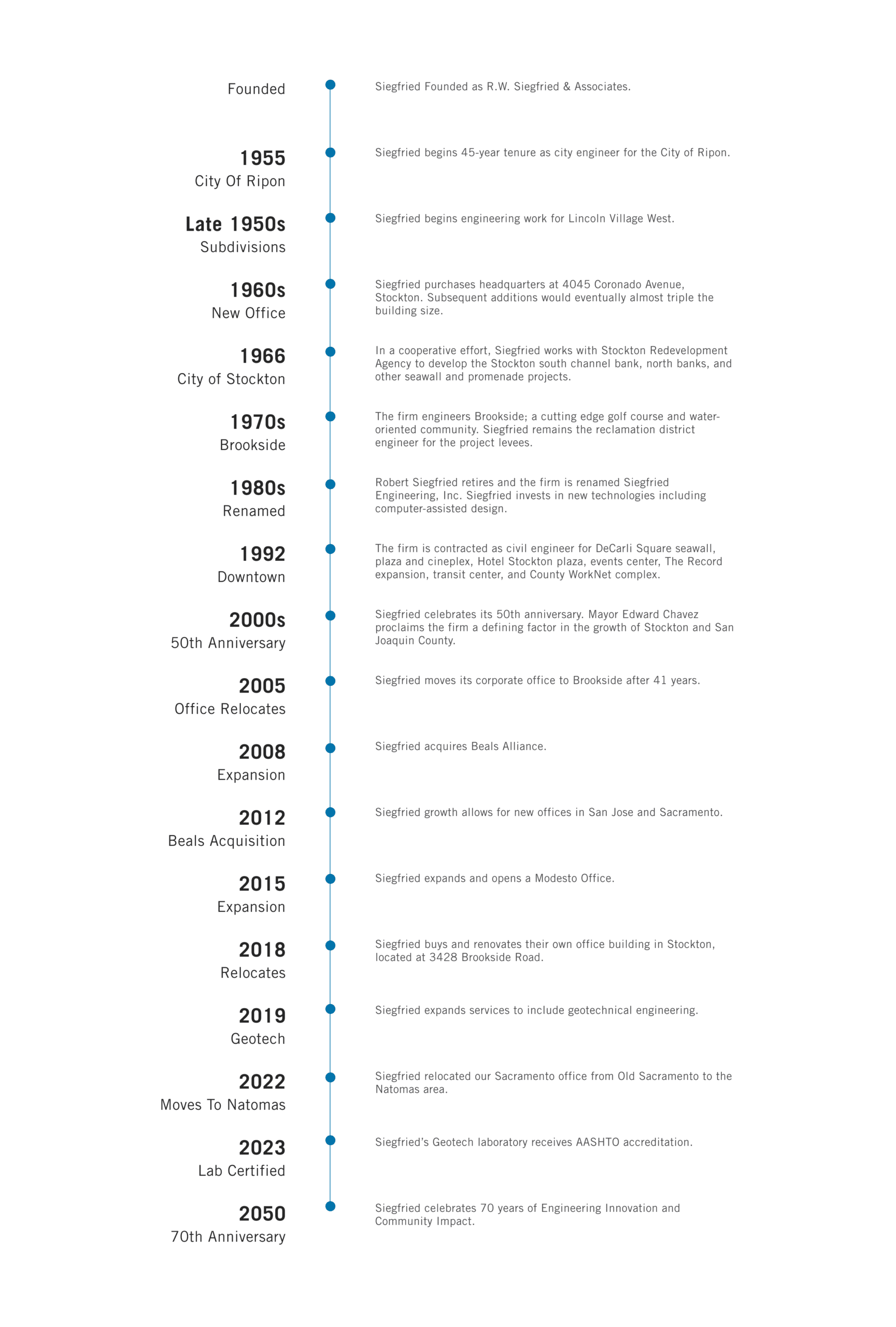
- Used WPBakery’s Raw HTML element to embed a responsive, inline-coded timeline showcasing Siegfried Engineering’s legacy.
- Managed the transition of a site from staging to live after final updates were made.

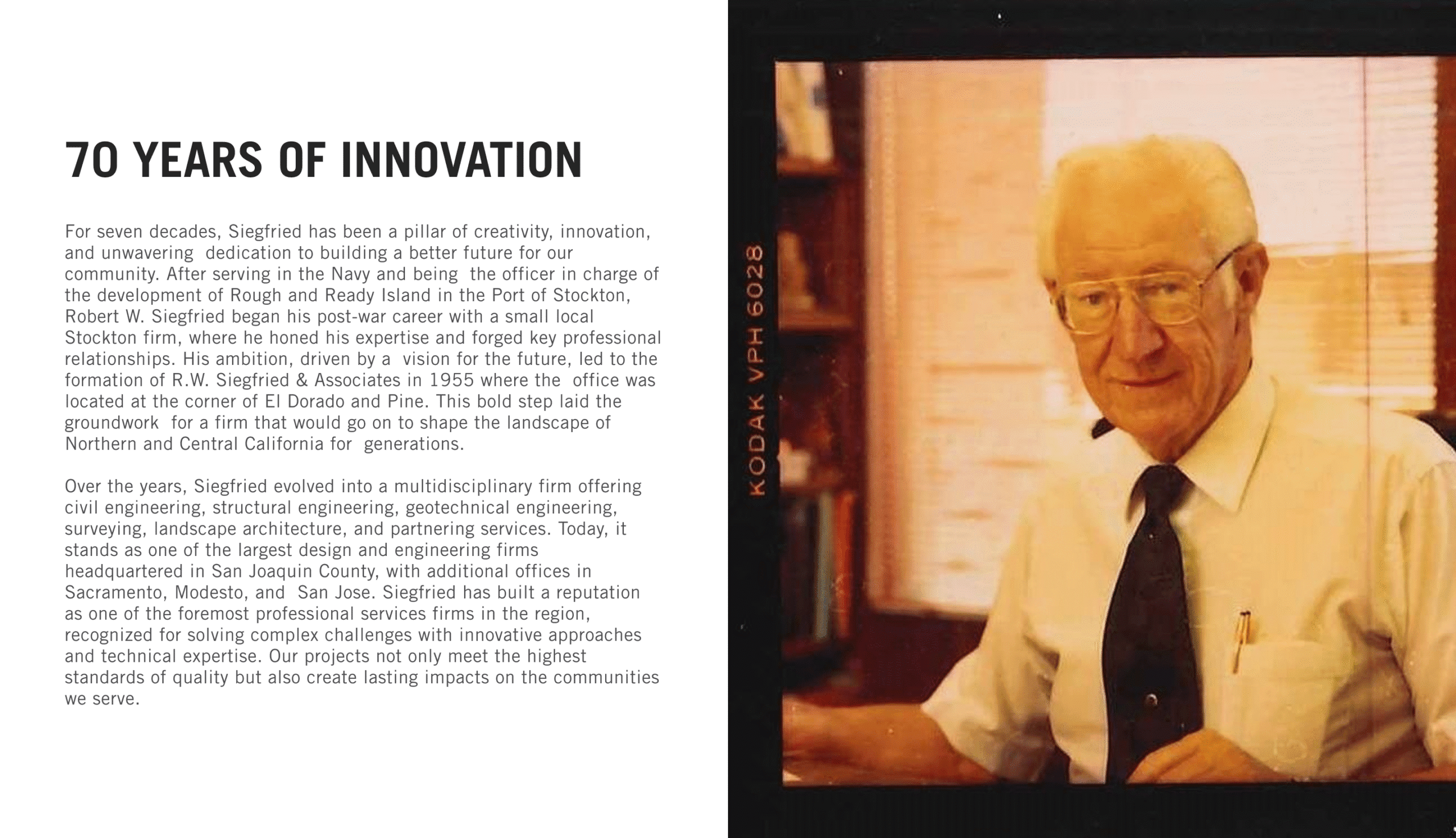
Key Final Pages


Outcome
-
Launched on time and within budget given the constraints
-
Hit a 95% performance score on Google PageSpeed Insights
-
Repositioned their web presence to attract enterprise clients and reduce irrelevant inquiries
-
Delivered a site aligned with modern best practices in accessibility, performance, and legal compliance

Final Key Sections