Overview
The Missing Piece is dedicated to simplifying the complex journey of caregivers and parents navigating life with young children on the Autism spectrum. Receiving a diagnosis comes with a flood of unknowns, and the additional challenges of Autism can make finding reliable, medically backed information even more overwhelming.
With a clear mission to provide a comforting and trustworthy resource hub, The Missing Piece envisioned a one-stop platform to support caregivers in improving their children's overall quality of life. While the visual direction of the application was initially undefined, the goal was unmistakable: to create a user-friendly, reassuring experience that empowers families with the knowledge and tools they need.
Role
UI Designer & Team Lead • Team Of 5 • Working under a Project Manager & Senior Designer.
Contact
Founder
Industries
Healthcare • Parenting • Education • Disability Resources
Type
App • B2C
Tools
Figma • FigJam • Loom • Zoom • Google Docs
Problem
Parents and caregivers of children on the Autism spectrum are deeply committed to providing the best possible care, but navigating the overwhelming amount of online information can be exhausting. Between endless articles, conflicting advice, and the time-consuming task of verifying sources, guardians often find themselves stretched thin. After fulfilling their daily responsibilities, they have little time or energy left to sift through medical resources. The Missing Piece set out to eliminate the guesswork by offering a trusted, centralized platform.
While the mobile app’s core functionality had been established, it lacked the visual and experiential elements needed to make it truly effective. Branding, colors, illustrations, typography, and other key UI components had been overlooked in a previous design phase. With an incomplete user experience, the agency was brought on to refine the interface, applying a cohesive and engaging design system to existing wireframes developed by a previous team.
Solution
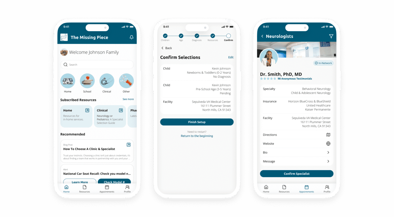
The Missing Piece app was designed to be a reliable and intuitive resource for caregivers. Users gain access to a centralized database of verified medical information, a platform for scheduling appointments, and guidance on personalized care plans. The app also helps families connect with physicians covered by their insurance, ensuring a seamless and informed experience.
To enhance usability and trust, we developed a style guide that was simple, professional, and calming. Thoughtfully chosen UI elements: such as warm imagery and intuitive card-based layouts, reinforced a sense of reassurance and ease. Additionally, we refined the existing design to reduce unnecessary clicks, minimizing friction in an already complex medical process. The result was an accessible, visually cohesive experience that empowered caregivers with the knowledge and tools they needed, all in one place.
DISCOVERY
Team Kick-Off Meeting
With team members spread across different time zones, I hosted two separate introductory meetings to ensure everyone had a chance to connect. Thanks to the magic of Figma, we were able to bring our team together; smiling faces and all.
During our kickoff, we established each member’s role, clarified expectations for communication, and addressed any preliminary questions. We also collaborated on strategies for meeting the client’s needs and mapped out a clear game plan for deliverables. This alignment set the foundation for a smooth and efficient design process.
Brief Materials Review
To get up to speed, we reviewed all existing project documentation, including Figma files and Google Docs containing wireframes, prior research, and initial UI concepts. This deep dive helped us understand where the previous team had left off and identify key insights to guide the next phase.
By analyzing these materials, we streamlined our discovery process: eliminating redundant topics and focusing on areas that needed further exploration. We also took note of client constraints, such as the absence of user testing and a temporary hold on development until critical milestones were met. This review ensured our team could move forward efficiently and strategically.
Client Questionnaire
To ensure alignment and avoid potential roadblocks, I encouraged the team to seek further clarification from The Missing Piece regarding their desired deliverables and how they envisioned the final product. Our questions covered key areas such as mission, branding, competition, and visual direction. These insights helped shape the foundation for the design approach, ensuring our work aligned with The Missing Piece’s vision and values.
The primary takeaways from these discussions were:
Soothing & Accessible Color Palette – The client emphasized the importance of a calming and gentle visual experience. They preferred soft shades of blue and pink to evoke relaxation, with small accents of purple and yellow to introduce a sense of curiosity and playfulness.
Visual Inspiration – For design references, The Missing Piece pointed to the Beliyf website and the Lumi mobile app as sources of inspiration, particularly for their clean, engaging, and user-friendly aesthetics.
A Brand Rooted in "Piece" & "Peace" – The company wanted to emphasize a thoughtful play on words: "piece" and "peace" as a core element of its branding. This concept would reinforce their mission to provide a supportive, engaging, and reassuring experience for caregivers and families.
Design
Design System: Initial Style Guide
Given the UI-intensive nature of this project, the team dedicated significant time to developing and refining the Style Guide. This document evolved alongside the project, continuously adapting to reflect new design decisions and insights gained throughout the process.
Rooted in the client’s vision, we focused on incorporating calming colors and intuitive UI elements to create a reassuring user experience. Team collaboration played a key role in shaping the guide, with each member contributing to fill in the gaps. I personally took ownership of designing buttons, list displays, and general enhancements to ensure consistency and usability across the platform.
This iterative approach resulted in a polished, cohesive design system that reinforced The Missing Piece’s mission of providing a seamless and supportive experience for caregivers.
UI Inspiration
The client was open to various design directions, as long as the final product featured inclusive depictions of patients and caregivers while maintaining a tranquil and accommodating user experience. With this in mind, I encouraged the team to reflect on the project’s goals and gather visual inspiration from both digital design and the natural world.
After compiling the team’s contributions, I identified common themes and organized them into a cohesive collage. Unsurprisingly, many medical institutions rely on blue and white palettes for their calming and clean aesthetic, which resonated with our design approach. These curated visuals served as a guiding reference as we moved into the next phase - preparing UI iterations for the client.
UI Iterations
To explore a range of possibilities, each designer created their own UI iterations before we came together to refine and present our strongest concepts to the client.
For my contributions, I developed two distinct approaches: one featuring pastel-colored backgrounds on carousel cards for a more playful feel, and another leveraging a predominantly blue-and-white palette to align with the clean, calming aesthetics commonly seen in the health and social services sectors.
Ultimately, my blue-and-white design was selected as one of the three variations presented to The Missing Piece. While this version deviated from the client’s initial request for more diverse colors, it provided a balanced alternative to the other, more vibrant submissions. This strategic selection ensured the client had a thoughtful range of options to consider.
High-Fidelity Screens
After reviewing the UI iterations, the client selected their preferred direction with a few minor adjustments. They favored the lighter blue color scheme from Option #1 but preferred the overall design approach of Option #2. To meet these requirements, the team collaborated to merge the best elements of both concepts into a cohesive final design. Before proceeding, I sent a final check to The Missing Piece to ensure alignment.
With approval in place, we transitioned into applying the refined UI to all pre-designed wireframes from a previous phase. Given the scale of the project: two extensive flows of wireframes and five designers, I divided the work into sections, allowing each team member to choose an area to refine. Since different screens connected throughout the user journey, the team coordinated closely to maintain consistency in components, auto-layout, spacing, colors, and other stylistic details. This collaborative approach ensured a seamless, polished high-fidelity experience.
Redesign
At this stage, the Senior Designer recommended refining the previous team's designs to follow best practices and improve screen real estate. Each designer contributed by adjusting individual screens to align with a standardized grid system featuring a 16px margin.
In my assigned section, I noticed that the spacing between input field labels and input boxes was too wide, making the relationship between them unclear and consuming unnecessary space. I refined these elements to improve readability and efficiency. Additionally, I conducted a consistency check across all screens, ensuring uniform spacing, alignment, and layout before submitting the updates for client feedback.
During this review, I caught an extra screen that needed removal due to an update in how confirmation pop-up notifications were handled. To streamline the user experience, we eliminated the unnecessary screen and rerouted users directly to the updated information screen, reducing friction and unnecessary clicks.
Prototype
As designers transitioned to other client projects, we needed to ensure that The Missing Piece’s development team had everything they needed to move forward without additional clarification beyond the contracted timeline. To support a seamless handoff, we built an interactive prototype that closely mimicked the real user experience.
This prototype allowed developers to navigate the app as intended, providing a tangible reference for functionality, interactions, and flow. By simulating real-world use, we streamlined communication and reduced ambiguity, ensuring that The Missing Piece’s vision translated smoothly from design to development.
Client & Developer Hand-Off
With the future development team in mind, we created detailed design artifacts to ensure a smooth transition from design to implementation. Every element: buttons, input fields, and containers - was outlined with exact pixel dimensions, while padding, margins, and white space were carefully documented to maintain consistency across the app.
To clarify interactions and user flows, we used virtual sticky notes within Figma, labeling key transitions and explaining the purpose behind each screen. Like other areas of the project, I took ownership of annotating and measuring my assigned screens, ensuring developers had the necessary guidance to bring The Missing Piece’s vision to life without ambiguity.
Reflection
Debriefing
Serving as the primary point of contact for The Missing Piece on behalf of the design team was both an honor and a valuable learning experience. This project was unique in that it was a UI-first initiative, requiring us to pick up where a previous team had left off. With only grayscale wireframes as our starting point, deciphering the original design intentions and extracting insights from prior research proved to be a challenge.
Despite constraints: limited client interactions, delayed feedback from senior members, and no direct communication with the original wireframe designers, our team successfully crafted a polished, user-centered UI that met The Missing Piece’s expectations. More importantly, our work contributed to an application designed to support caregivers and parents navigating the complexities of autism care. The project was a testament to adaptability, collaboration, and the impact of thoughtful design.


