Role
UX/UI Designer & Team Lead • Team Of 5 • Working under a Project Manager & Senior Designer.
Contacts
Founders
Industries
Social Media • Travel & Tourism • Photography • Mapping & Geolocation Technology
Type
App • B2C
TOOLS
Figma • FigJam • Loom • Zoom • Google Docs • Slack
Overview
Travel Pins is a new social media app designed for travelers to visually document and explore destinations. By organizing posts on an interactive map, users can see where their friends have been, discover must-visit spots, and plan future itineraries with ease. The platform simplifies the process of sharing travel experiences while inspiring new adventures. With a strong concept in place but no existing product, Travel Pins needed a UX/UI strategy to bring their vision to life.
Problem
Travel Pins was starting from the ground up, with no existing UX or UI framework. The company needed a UX/UI design team to shape the product into an intuitive and engaging experience.
From a UX perspective, key features had not yet been defined in detail, and there was no clear user flow. A seamless journey from discovering locations to sharing posts was essential, with a strong emphasis on the primary call-to-action: getting users to attach pictures to locations.
On the UI side, there was no established brand identity; no color palette, typography, iconography, or visual style. The challenge was to create a distinct and compelling interface while differentiating Travel Pins from existing platforms like Google Maps and Pinterest, which shared some overlapping features.
Solution
Using client-provided User Stories, the design team developed a structured user flow that guided users through key actions, including signing up, posting travel photos, and discovering new destinations. Multiple discovery methods were integrated to ensure a flexible and engaging experience tailored to different user needs.
To enhance usability and encourage engagement, the design placed user-generated images at the heart of the interface, making exploration and social interaction more immersive.
A comprehensive style guide was created, defining core UI elements such as color, typography, and iconography. This provided a scalable foundation, ensuring that future features could seamlessly align with the established visual identity.
DISCOVERY
Team Kick-Off Meeting
The team gathered for an initial meeting to align on project goals and review the briefing materials provided by the Project Manager. After discussing our initial thoughts, I outlined expectations for tackling each deliverable and proposed a structured approach to task distribution.
To ensure efficiency and clear ownership, each designer was assigned a specific User Flow, with one flow being a collaborative effort between two team members. This setup allowed us to focus on creating seamless, intuitive experiences while leveraging individual strengths. The client also provided User Stories, which served as a foundation for our design decisions moving forward.
#1
As a user, I want to be able to login to my account.
#2
As a user, I want to be able to create an account.
#3
As a user, I want to be able to use the map function to search.
#4
As a user, I want to be able to upload a photo for each spot I visit.
Client Questionnaire
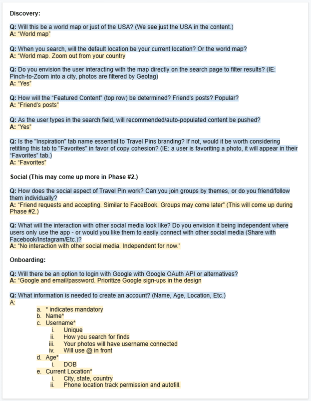
To ensure the team started with a clear direction, I asked everyone to review the briefing materials prepared by the Project Manager and contribute to a shared Google Doc with questions for the client. I encouraged them to think beyond the obvious and prioritize gaining insights early to avoid misalignment later.
Once I gathered the client’s responses, I shared them with the team. Since we were in Phase 1, some features were planned for Phase 2, making it essential to understand the long-term vision while designing the app’s core functionality.
Public Profiles & Posts – User accounts and posts will be publicly viewable, functioning similarly to Facebook. Featured content will be determined by a user’s friends’ posts.
Smart Search Suggestions – As users type in the search field, recommended and auto-populated content will appear for a more seamless discovery experience.
Map-Centric Experience – The world map will serve as the app’s focal point. Users will start with their home country as the default view, and clicking on different locations will reveal new travel posts.
Future Enhancements (Phase 2) – Later updates will introduce social groups, commenting features, and integrations with other social media platforms.
User Flows
After delegating responsibilities, the team and I translated the User Stories into detailed flow diagrams, mapping out the exact steps a user would take to navigate the app and complete key tasks. This process ensured clarity in functionality and a seamless user experience.
I personally took on User Flow #4: Posting a Photo, the app’s primary call to action. Since user-generated content was at the core of Travel Pins, it was crucial to design an intuitive and engaging posting experience that encouraged seamless sharing.
Ideation
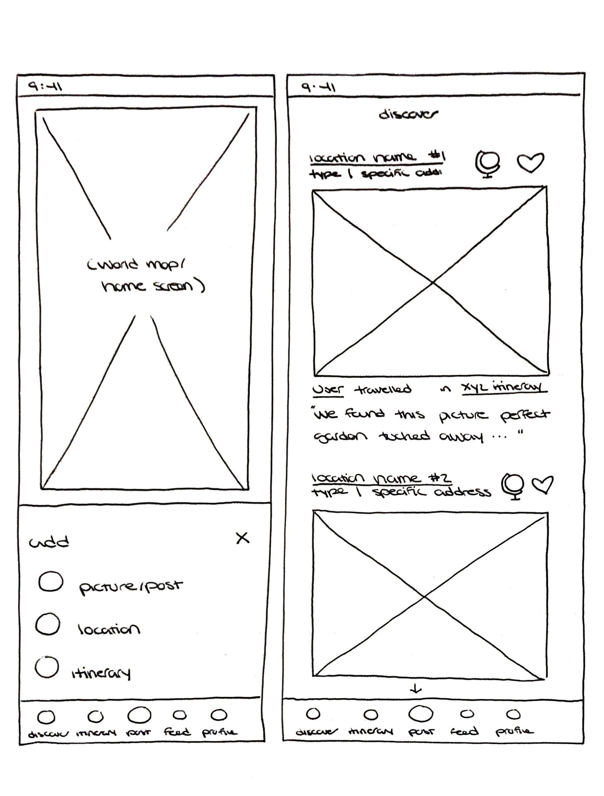
Sketching
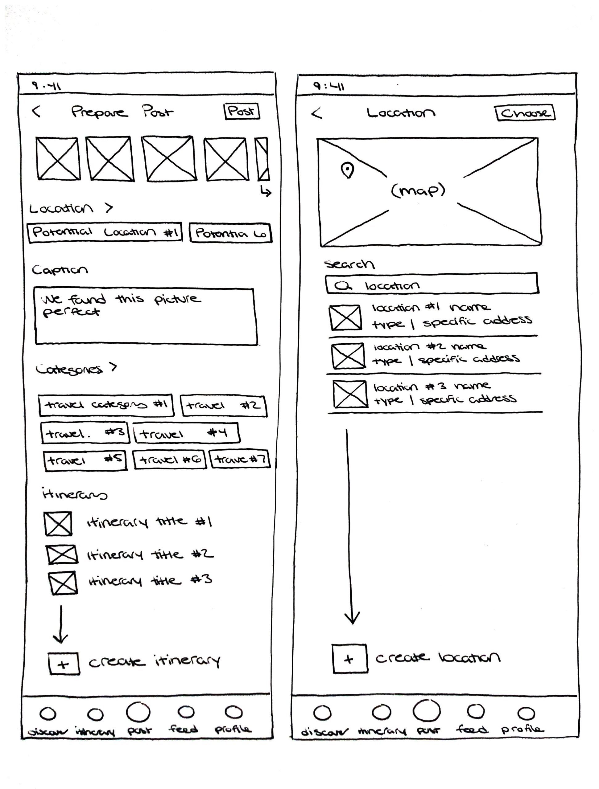
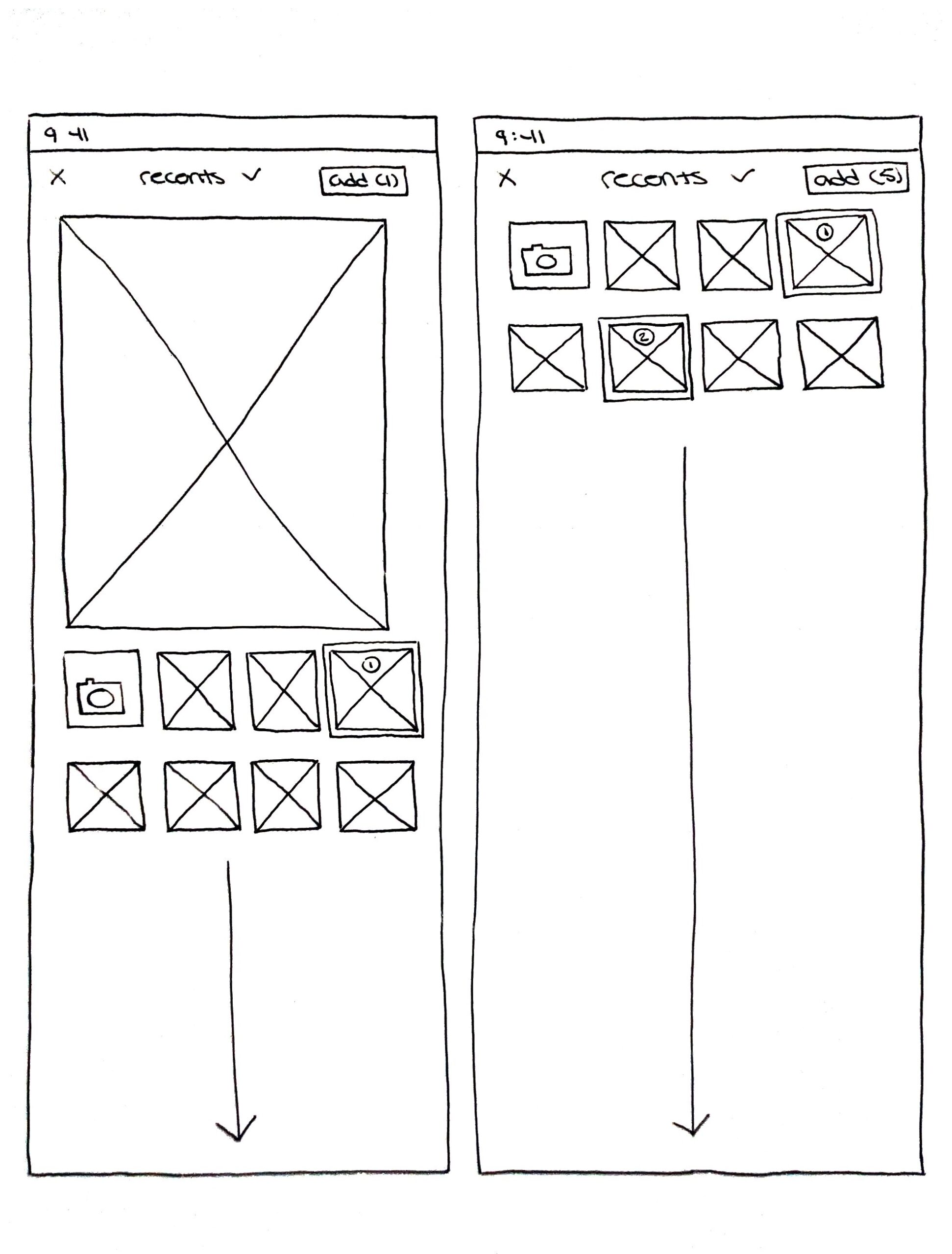
Since adding location-based posts was the core action driving engagement, it needed to be a seamless and intuitive experience. A well-designed posting flow would encourage users to share their travels, sparking a chain reaction of friends saving locations for future trips.
To refine this experience, I explored the sequence of actions: selecting images, choosing a location, adding a caption, and connecting the post to a new or existing itinerary. While I didn’t require the team to sketch, I personally find this method valuable for working through layout ideas and interaction flows before moving into high-fidelity designs.
Mid-Fidelity Wireframing
Building on my sketches, I translated the concepts into mid-fidelity wireframes in Figma, establishing the app’s basic structure. Using grayscale elements and simple shapes allowed for rapid iteration without being tied to a specific visual style. This flexibility made it easy to refine layouts and interactions before committing to high-fidelity design.
To ensure a seamless transition from paper to screen, I adjusted proportions to better reflect a real-world digital product. For this phase, each team member remained assigned to the User Flow they had been working on, ensuring continuity and a deeper understanding of their respective features.
Client Check-In Meetings
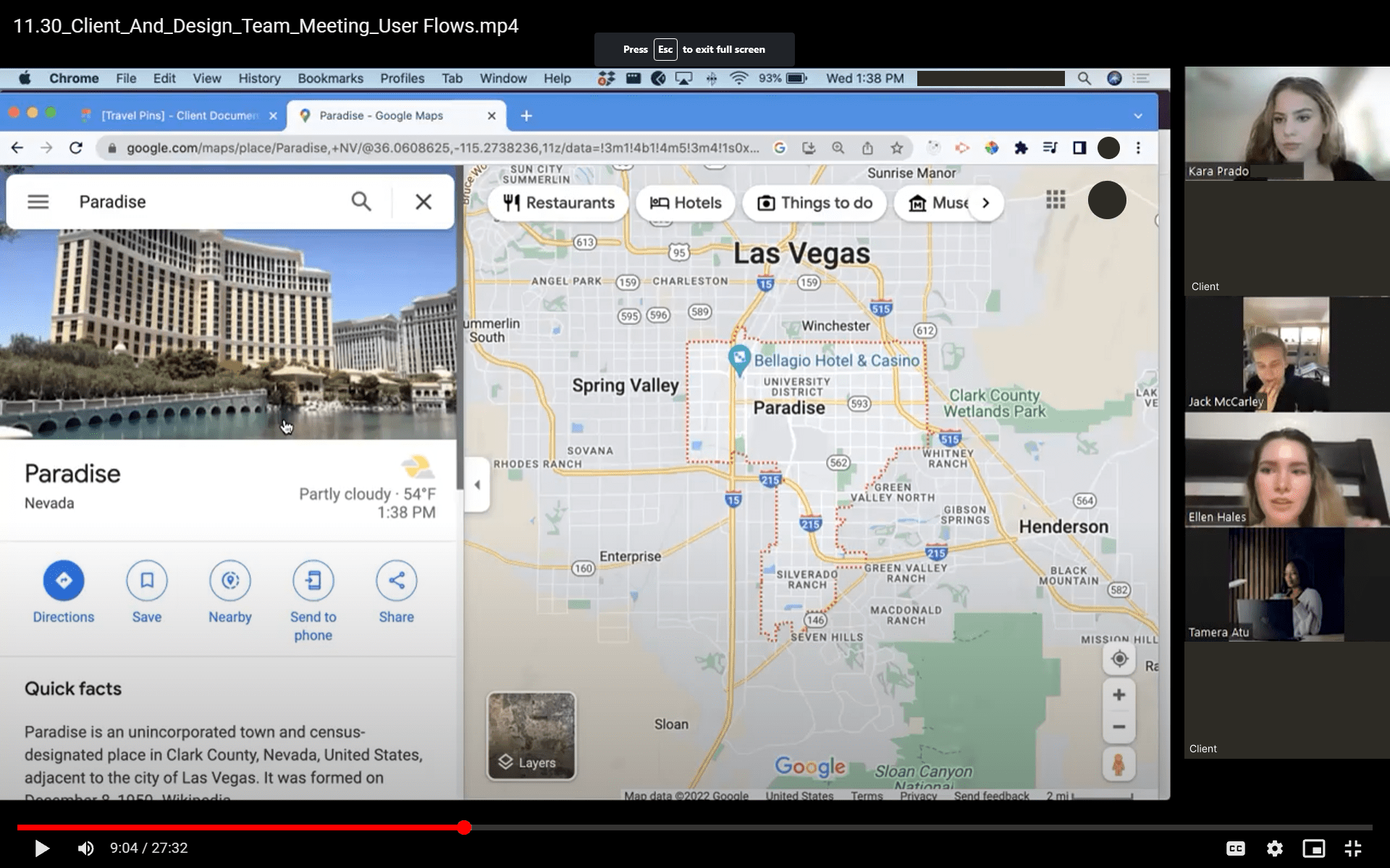
To keep the project aligned with the client’s vision, I scheduled team-wide meetings to review progress, clarify details, and collaborate on how key functionalities would take shape. Throughout the project, the full team met with the client on two occasions, ensuring alignment and reducing unnecessary back-and-forth communication.
Beyond these meetings, I maintained regular touchpoints with the client, providing updates and gathering feedback on each major iteration of our deliverables to ensure we stayed on track and made informed design decisions.
Design
Design System: Initial Style Guide
When curating the mood board, I drew inspiration from the feeling of traveling across oceans and skies to breathtaking destinations. A cool-toned blue emerged naturally as the foundation of the color palette; not only evoking a sense of adventure and tranquility but also ensuring strong accessibility. To complement it, I incorporated warm yellow for a friendly, inviting touch and light stone gray for a refined, sophisticated balance. The overall palette was designed to feel clean and unobtrusive, allowing user-generated travel photos to remain the focal point.
For typography, the goal was simplicity and readability, ensuring users could scan locations effortlessly. With so many places to pin and explore, the focus always came back to the imagery - keeping the text clean and easy to navigate.
To create a cohesive style guide, the team collaborated on defining the app’s visual identity. I paired two designers per category, rotating assignments across the six sections to leverage each person’s strengths. I personally led the color selection and grid system while also assisting with icons, imagery, and overall layout, ensuring a polished and visually engaging design system for the client.
UI Inspiration
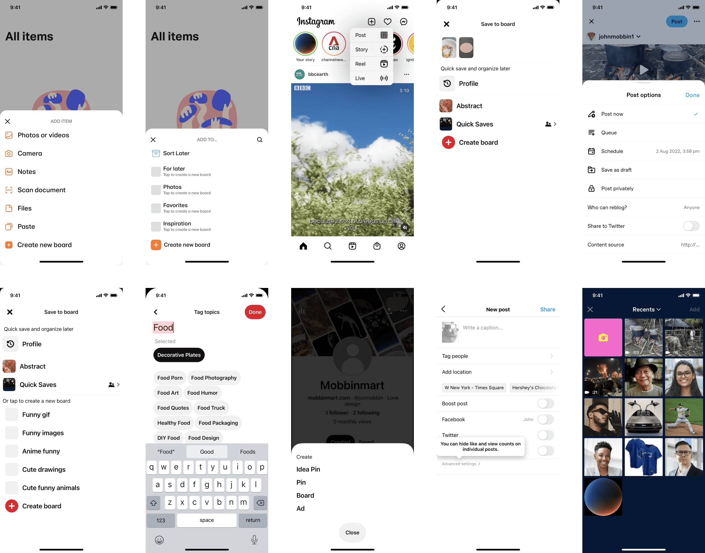
As my primary focus was User Flow #4: Uploading a Post, I researched best practices from leading platforms with similar content-sharing features, such as Pinterest, Instagram, and Tumblr. Analyzing their upload processes helped refine an intuitive and engaging posting experience for Travel Pins.
For visual inspiration, the team gathered references from apps that effectively integrated mapping functionalities while maintaining a bright and clean design. These explorative visuals helped shape a UI that felt both functional and inviting, ensuring users could seamlessly share their travel experiences.
UI Iterations
To explore different visual approaches, I asked the team to create one to two UI iterations each for the search-by-category sequence, experimenting with variations in padding, color schemes, and layout. After reviewing the designs, I selected the top three iterations (shown below) and submitted them to the client for feedback.
For my own contribution, I focused on enhancing readability and visual hierarchy. I enlarged the location card to provide extra breathing room, though this reduced the number of visible locations at a time. I also incorporated a soft shadow for depth and stayed true to the travel-inspired blue, yellow, and stone color palette, maintaining a clean and inviting aesthetic.
High-Fidelity Screens
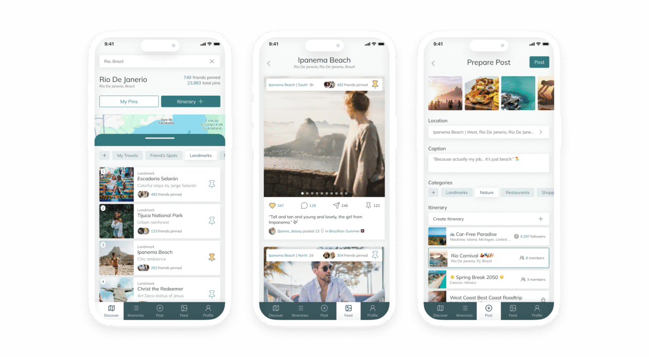
The client ultimately selected my screen as the final direction but requested a few refinements inspired by other iterations. These updates included square images instead of portrait, a more prominent bottom tab bar, and shorter destination cards to increase the number of visible locations per screen.
With these adjustments in mind, the team transitioned from grayscale wireframes to the polished, high-fidelity designs shown below. Each designer continued refining their assigned User Flow, while I oversaw the overall consistency in visual style, layout, and usability to ensure a cohesive final product.
Redesign
After receiving client feedback, I quickly addressed several updates impacting my User Flow and resubmitted the refined version:
Add Category Button – The original design was too thin and inconsistent with other buttons. I adjusted its shape to be more square-like for visual balance and improved touch accessibility.
Post Confirmation Flow – Instead of displaying a pop-up confirmation after posting, the user is now taken directly to their newly created post, aligning with best practices from other social media apps.
Add New Post Module – This step was initially an extra layer in the process. It was streamlined to only include the image upload action before being removed entirely, as tapping "Post" in the bottom navigation now directly opens the camera roll.
Beyond these updates, the entire team collaborated to refine various flows based on additional client requests. I personally helped redesign and resize the favorite icons from bookmarks to hearts and adjusted variants of the bottom navigation bar to better indicate the user’s location within the app.
Prototype
With all necessary updates in place, the team and I built an interactive Travel Pins prototype, allowing the client to experience the app’s functionality firsthand before development began. The prototype simulated key interactions, from pinning destinations on the map to creating and sharing posts, ensuring a seamless and engaging user experience.
Each designer first added interactions to their respective screens, enabling buttons, text fields, and navigation elements. Once the individual flows were complete, I helped connect the different User Flows, ensuring smooth transitions between actions like searching for destinations, posting photos, and saving locations to an itinerary. The final prototype provided the client with a realistic walkthrough of how users would explore, share, and engage with travel content on the platform.
Client & Developer Hand-Off
To ensure a smooth transition from design to development, I instructed each designer to add element dimensions to their respective User Flows. Additionally, we incorporated detailed annotations throughout the project, outlining navigation patterns and key interactions to provide clarity on how users would move through Travel Pins.
Consistency was a priority, not just for a cohesive user experience but also to streamline development. We focused on creating interchangeable and reusable components, ensuring that every screen felt unified while reducing redundant work for the developers. With comprehensive documentation, precise measurements, and a well-structured design system, the development team was equipped to efficiently bring Travel Pins to life.
Reflection
Debriefing
Leading the Travel Pins project was an incredibly rewarding experience, made even better by working alongside a talented and dedicated team. Each designer contributed high-quality work, met every deadline, and remained flexible in adapting to client feedback. Their collaboration and willingness to assist each other made the project a true success.
On a personal level, this project provided a valuable opportunity to work closely with the client, strengthening my ability to articulate design decisions on behalf of the team. Balancing big-picture oversight with hands-on design work required maintaining an intimate understanding of every screen and its functionality. As a Lead, I wore many hats; from ensuring consistency across flows to problem-solving and guiding the team, and I found the role both challenging and fulfilling. It’s an experience I would eagerly take on again.
